Kate Moss photographed by Russell Young
Lounge designed by Luis J. Garcia-Maldonado
As part of #Blogfest2013, attendees were given an entire morning to visit the Kips Bay Boys and Girls Club 41st Annual Decorator Show House in New York City. We had the Upper East Side multi-story luxury townhouse – owned by NY lawyer Richard Sharp, it’s valued at over $16 million – completely to ourselves. We were encouraged to take as many photos as we would like to later share with our readers and followers. Typically, photography is not allowed when visiting a show house, so this was a real treat for all of us design bloggers! The show house runs through June 4th so schedule a visit if you are able – it’s certainly worth the trip! All proceeds go towards supporting the Boys and Girls Club of Kips Bay mission:
“To improve and enhance the quality of life for all young people 6 – 18 so they can realize and achieve their potential for growth, development and attain skills necessary to succeed.”
As I am currently working on a couple of spaces for a show house myself, I was thrilled to see how NY designers pull it off. They had just one month to transform their rooms and the results were incredibly glamorous!
More from the gray and ginger lounge by Luis J. Garcia-Maldonado: Fabulous art, rich textures and come hither seating.
Avant garde photographs graced most rooms including the entry area by Andrew Sulvalsky. Paired with a turquoise ceramic lion that is by comparison quite demure.
More turquoise in a highly lacquered powder room also by Sulvalsky. Brass fixtures and ebony bowl make for a striking combination.
Lacquered walls were a common thread throughout the show house. This dining room by Kristin McGinnis was eye catching in so many ways from the uniquely organic light fixture to the artist battered side boards to the silver leaf ceiling. So stunning!
“Your boyfriend is hot” reads a concert goer’s T in this well chosen art installation for the hidden bar off the dining area. Space by Joan Dineen.
The second floor drawing room by the mother-daughter team of Mariette and Brooke Gomez is Upper East Side elegant. How I would love to host book club in this dedicated-to-entertaining space that easily seats over a dozen guests.
Show stopping seating areas like this golden velvet sofa in the atrium, designed by James Huniford, invite curl up and get comfortable conversation. Just outside this room, the courtyard provides an additional stop and sit for a spell incentive. This is one designed space that many of us in the suburbs or city could probably achieve: boxwood border, pea stone floor, one great statement piece of outdoor furniture.
Back inside, an underwater story is told via pitch black wallpaper from Kravet patterned with sea-life illustrations by Fornasetti paired with coral colored silk damask from Fortuni and liquid blue drapery panels. The feeling in this fourth floor sitting room by Jack Levy is one of being pleasantly ensconced in the deep, dark abyss of the ocean. I could spend some serious time in this room!
Another favorite space of mine was the Modern Family Room by Eve Robinson. I am a real fan of Modern Family interpretations, but this sophisticated game room is a little outside of my comfort zone as far as young family livability. Even so, it would be a nice place to play pretend.
Sparkling amethyst bar: yes, please!
The Kips Bay kitchen was designed by Christopher Peacock. I wasn’t able to get a really good picture of the full space since this central location is where all of us Blogfest bloggers gathered to enjoy a lovely brunch set by Doodle Home. Doodle Home is an online resource that helps designers by handling the ordering and tracking and large amounts of paper trails that are associated with the completion of design projects. While the company started out geared toward the general consumer, they quickly discovered that they could be of great value to the independent designer who knows what they want, but could use a more streamlined method of project management. The end result is more time to design. Sign me up!
Another view of the jewel-toned entryway by Andrew Sulvalski.
The golden stairway serves as a photo gallery, arranged with black and white images of Boys and Girls Club guests paired with their thoughts on what Kips Bay means to them: “It is home” one exclaims. Photos taken by Monica Rich Kosann. Stairway designed by Judy King.
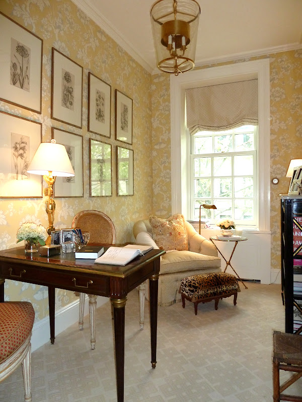
A lady’s writing room by Stephen Mooney was the closest to traditional New England style design that I saw at the show.
Bravos “Million Dollar Decorator” Kathryn M. Ireland designed the master bedroom incorporating traditional-meets-bohemian fabrics from her new collection for Scalamandre.
This whirlpool tub is obviously part of the original decor of the home, however the artwork and color palette were quite beautiful. Lounge bath by Luis J. Garcia Maldonado.
This soaking tub is more my style. When you work at a bath showroom, these are the types of images one falls in love with! Can you imagine having a roof-top deck with this installation? Across from the tub was a koi pond. Everything about the space was breath-taking (or perhaps “meditation inducing” is a better way to describe it?) Kudos goes to West Chin Architects.
Designer show houses are a great resource for window treatment ideas. Sitting room above by Barbara Ostrom. Tasting room below by Dineen Architecture and Design.
There are a wide variety of online reviews of the current Kips Bay Decorator Show House (from my fellow #Blogfest2013 bloggers and otherwise), but I particularly liked the perspective of this article from The New York Times ...


0 comments:
Post a Comment