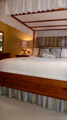
 AFTER: soft spring green combines with plum, yellow, white
and gray to create a fresh color palette for a master bedroom.
Recently I made it back to check on the end result of a
decorating project that I planned for one of my clients.

Her decorating goal was to freshen up her master
bedroom by painting the walls, adding fabrics in cheerful colors, and at the same time improve the layout while reusing the existing furniture.
I was happy to help!

Here is the before shot of the room: lots of traditional fabrics in neutral colors – black and white toile combined with a tan plaid and medium sized check – nice enough, but she was tired of the look. Accessories seemed to be all in the same color resulting in little to no contrast. The gray walls seemed drab next to the warm color of the furnishings, and the decorative painting over the arched window and doorways did not help to create a sense of calm in this area of rest.

First we addressed the layout. By rotating the bed to the left-hand wall in front of the smallest window, we were able to open up the room considerably. The pair of chairs with ottomans were moved over to the corner making a more intimate seating area positioned by the window for natural light. We moved the television onto a corner unit stand that could now be viewed both from the chairs or from the bed. Two dressers and a favorite curio cabinet also were repositioned along walls more suited to their sizes.
 BEFORE: This corner was under-utilized
and the view outside the window was not
as good as the blocked view outside the
palladian window behind the bed.
 BEFORE: This corner was under-utilized
and the view outside the window was not
as good as the blocked view outside the
palladian window behind the bed.
In the end, only a handful of new pieces were added to the room including a shapely pair of lamps with the perfect colored shade that I found at HomeGoods, a white ceramic garden stool was brought in to add shine and contrast to the warm woods, and the TV stand is also new (sorry, I did not get a shot of it). Items that were taken out included a basket collection, a small painted table, and the candlestick lamps with toile shades. We also incorporated some larger more graphic works of art on the walls to replace the many small framed prints that we edited out.


During the process, I gave my client a few different options on fabric choices and I was glad she chose this modern twist on traditional. By using a confident mix of bold patterns with predominantly solid fabric choices the end result still has personality, but in a more subdued way. I was also happy to see her “go green” by re-dressing her existing furnishings instead of completely starting over, creating a new look
while honoring pieces collected over time.

while honoring pieces collected over time.


0 comments:
Post a Comment